Responsive & Mobile Optimization
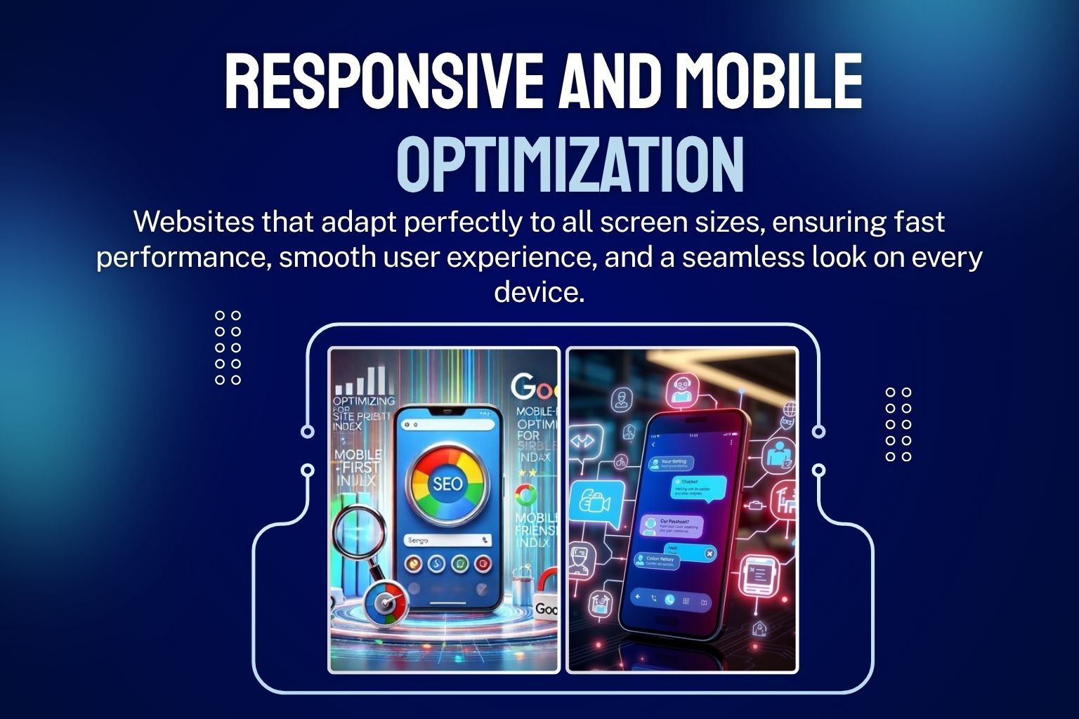
Deliver a seamless experience across all devices ŌĆö and never lose a mobile visitor again.
Today, the majority of your website traffic comes from mobile devices. If your website isnŌĆÖt fully responsive, youŌĆÖre not just providing a poor user experience ŌĆö youŌĆÖre losing potential customers every single day.
Our Responsive & Mobile Optimization service ensures your website looks perfect and works flawlessly on all screen sizes ŌĆö smartphones, tablets, and desktops. We optimize layout, design, and functionality so your users get a smooth and engaging experience no matter how they access your site.
We donŌĆÖt just make your website ŌĆ£fitŌĆØ on mobile ŌĆö we make it perform. From improving touch interactions and readability to optimizing speed and navigation, we ensure your mobile users stay longer, engage more, and convert better.
Whether itŌĆÖs a business website or an e-commerce store, we help you create a mobile-first experience that boosts user satisfaction, improves SEO rankings, and increases conversions.
¤ÜĆ Start Your Project TodayService process
We analyze your current website across different devices to identify layout issues, usability problems, and performance gaps.
We create a customized plan focused on improving user experience, navigation, and design for mobile users.
We optimize layouts, images, typography, and elements to ensure perfect display on all screen sizes.
We test your website on multiple devices and browsers to ensure consistent performance and user experience.
- 01. Mobile Responsiveness Audit
- 02. Mobile-First Strategy Planning
- 03. Design Implementation
- Testing Across Devices
Services outcome
We help businesses create fully responsive websites that deliver a smooth, engaging, and high-converting experience across all devices.
- Fully Responsive Design (All Devices)
- Improved Mobile User Experience
- Faster Mobile Loading Speed
- Better SEO Rankings (Mobile-Friendly)
- Increased Engagement & Conversions
- Consistent Performance Across Devices